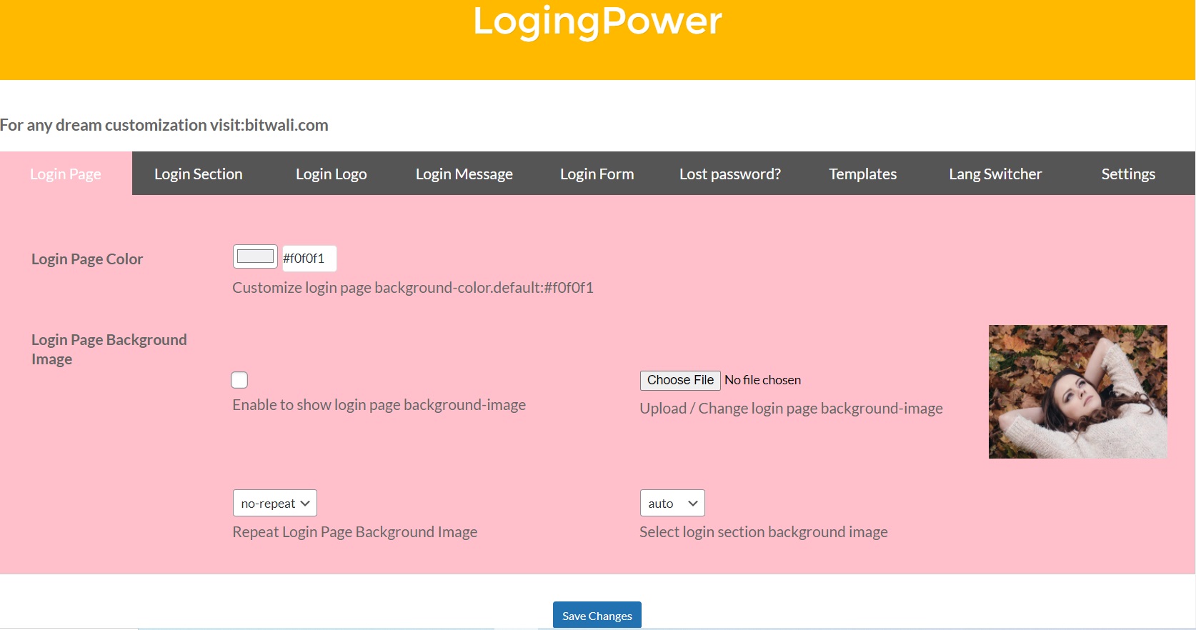
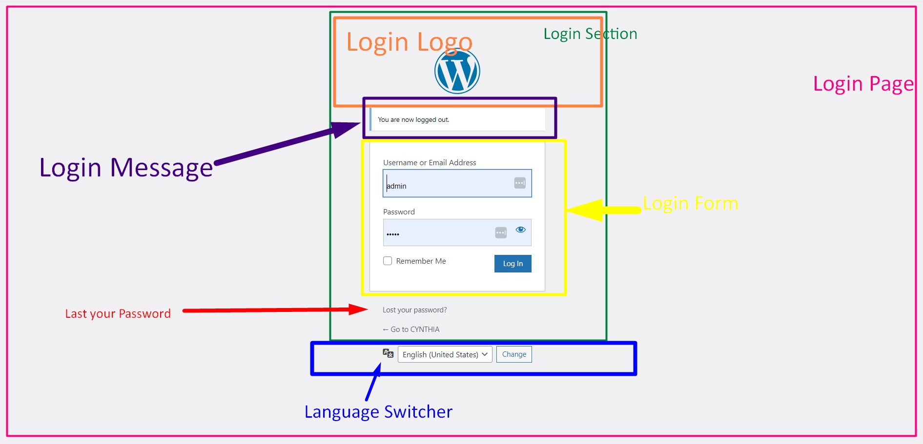
To change the color of the login page, two very easy methods are provided. Select your desired color from the color picker and click the Save Changes button, or copy and paste or type the hexadecimal number of your desired color into the text box. Click the Save Changes button
Enable checkbox to show login page background image, uncheck to hide login page background image.
Click the button to change the background image of the login page. Choose an image. Click Save Changes.
There are 4 options for the background image repeat of the login page, including repeat, repeat x, repeat y, no repeat, choose any option according to the nature of your image and beautify it.
We can resize the image by selecting from auto, width, height or both.
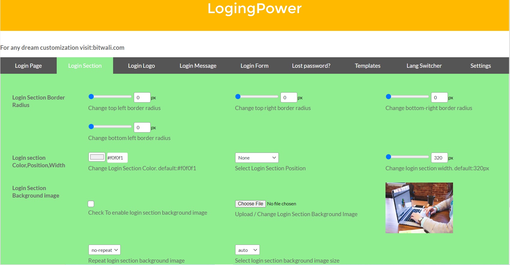
Border radii can be easily changed, from 0 to 100px, by scrolling, typing or pasting.
There is also a feature to change the color of the login section as per your choice. For default color settings, copy the default color, paste it into the text box, or select it from the color control.
Six options are listed to change login section position..
You can change its width from 320 to 1000 pixels.
Enable checkbox to show login section background image, uncheck to hide login section background image.
Click the button to change the background image of the login section. Choose an image. Click Save Changes.
There are 4 options for the background image repeat of the login section, including repeat, repeat x, repeat y, no repeat, choose any option according to the nature of your image and beautify it.
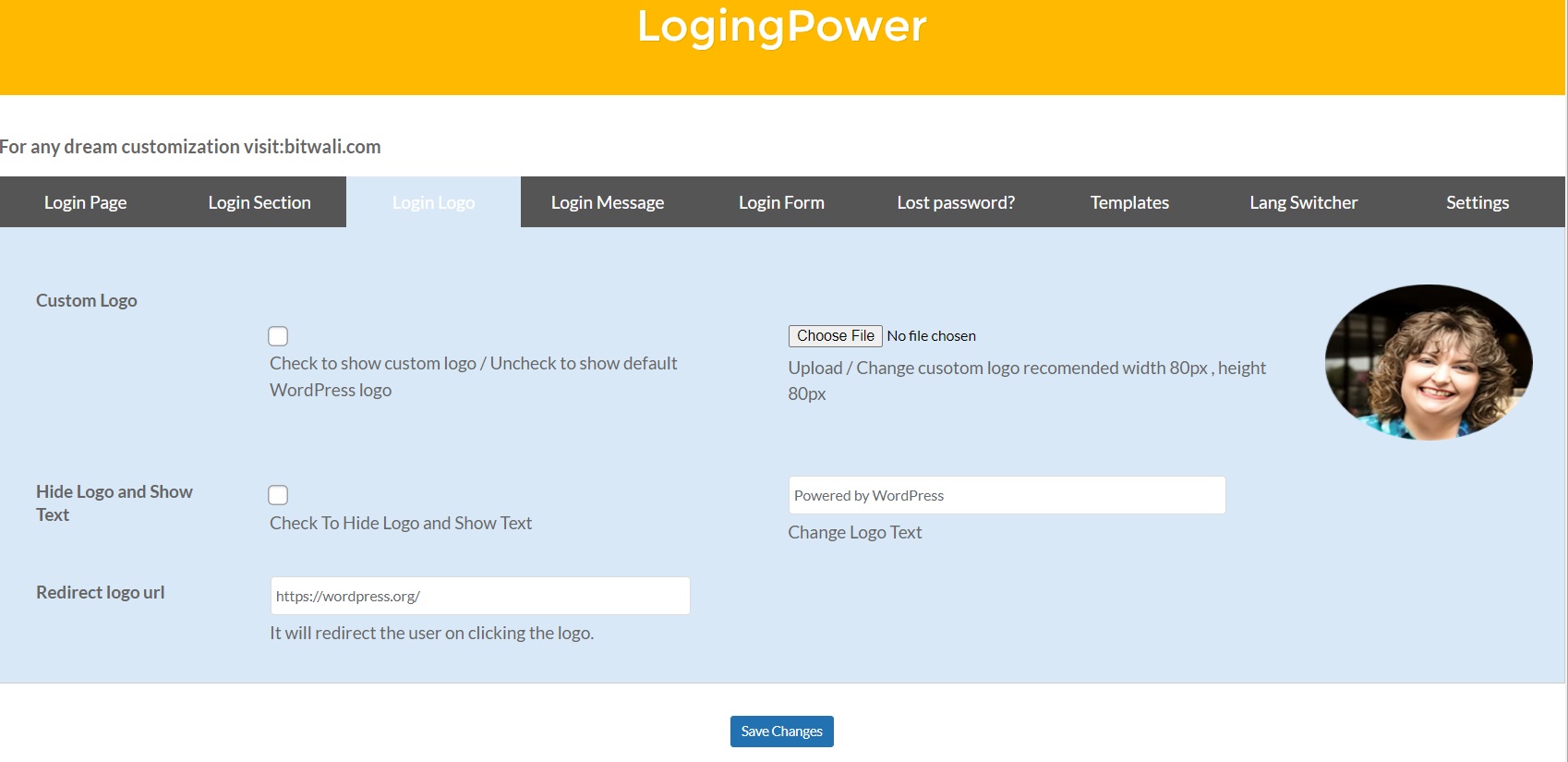
For custom logo, first you need to check its checkbox. After that, the Defined Custom logo will appear. Use the button to upload your logo. Remember its recommended size is 80 pixels.
Unchecked, the checkbox is for the logo. To see some text instead of the logo, make the checkbox checked.After making any changes, don't forget to press the Save Changes button.
In the text box, enter the text you want to appear in place of “Powered by WordPress”.
Whenever the user clicks on the logo, it will redirect the user to this link.
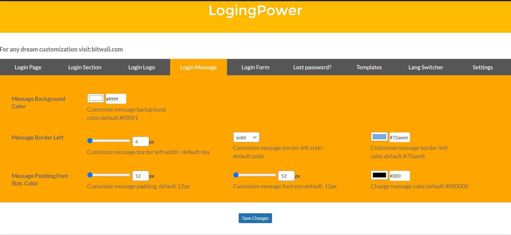
To change the color of the login page, two very easy methods are provided. Select your desired color from the color picker and click the Save Changes button, or copy and paste or type the hexadecimal number of your desired color into the text box. Click the Save Changes button.
The default width of the left border of the message is 4 pixels, it can be adjusted from 4 to 20 with the scroll bar. Additionally, values 4 to 20 can also be entered in the text box.
A list of border styles is given. Click on the list, all the options in the list will be displayed, click on your desired option and save.
To change the color of the login page, two very easy methods are provided. Select your desired color from the color picker and click the Save Changes button, or copy and paste or type the hexadecimal number of your desired color into the text box. Click the Save Changes button.
Padding value can be chosen from 12 pixels to 30 pixels by scrolling or entering. The default is 12 pixels.
Message Font Size can be chosen from 12 pixels to 44 pixels by scrolling or entering. The default is 12 pixels.
To select a color for the message, click a color from the color picker to select a color or enter the hexadecimal code of your desired color.
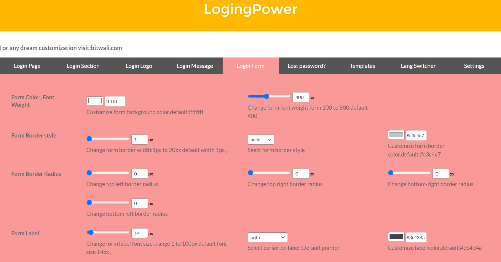
To change the color of the login form, two very easy methods are provided. Select your desired color from the color picker and click the Save Changes button, or copy and paste or type the hexadecimal number of your desired color into the text box. Click the Save Changes button.
The default font weight of the form is 400 pixels, it can be adjusted from 100 to 800 px with the scroll bar. Additionally, values 100 to 800 can also be entered in the text box.
A list of border styles is given. Click on the list, all the options in the list will be displayed, click on your desired option and save.
To change the color of the form border color , two very easy methods are provided. Select your desired color from the color picker and click the Save Changes button, or copy and paste or type the hexadecimal number of your desired color into the text box. Click the Save Changes button.
Top Left Border Radius defines the radius of the top left's corners.Change the border radius from 0 to 100 pixels by scrolling or typing۔
Top Right Border Radius defines the radius of the top right's corners.Change the border radius from 0 to 100 pixels by scrolling or typing۔
Bottom Right Border Radius defines the radius of the bottom right's corners.Change the border radius from 0 to 100 pixels by scrolling or typing۔
Bottom Left Border Radius defines the radius of the bottom left's corners.Change the border radius from 0 to 100 pixels by scrolling or typing۔
Form Label Font Size can be chosen from 1 pixels to 100 pixels by scrolling or entering. The default is 14 pixels.
The Cursor on Label specifies the mouse cursor to be displayed when pointing over Label.
To change the color of the form border color , two very easy methods are provided. Select your desired color from the color picker and click the Save Changes button, or copy and paste or type the hexadecimal number of your desired color into the text box. Click the Save Changes button.
Change the label of Username or Email Address.
Change the label of Password.
Change the label of Remember Me.
The default width of the input border width of the form is 1 pixel, it can be adjusted from 1 to 20 with the scroll bar. Additionally, values 1 to 20 can also be entered in the text box.
A list of border styles is given. Click on the list, all the options in the list will be displayed, click on your desired option and save.
To change the color of the form input border color , two very easy methods are provided. Select your desired color from the color picker and click the Save Changes button, or copy and paste or type the hexadecimal number of your desired color into the text box. Click the Save Changes button.
Top Left Border Radius defines the radius of the top left's corners.Change the border radius from 0 to 100 pixels by scrolling or typing۔
Top Right Border Radius defines the radius of the top right's corners.Change the border radius from 0 to 100 pixels by scrolling or typing۔
Bottom Right Border Radius defines the radius of the bottom right's corners.Change the border radius from 0 to 100 pixels by scrolling or typing۔
Bottom Left Border Radius defines the radius of the bottom left's corners.Change the border radius from 0 to 100 pixels by scrolling or typing۔
There is a facility to change the height of input fields from 50 to 100 pixels. Change the desired height by scrolling or by entering.
To change the color of the form border color , two very easy methods are provided. Select your desired color from the color picker and click the Save Changes button, or copy and paste or type the hexadecimal number of your desired color into the text box. Click the Save Changes button.
TThe submit button width can be adjusted from 25% to 100% depending on the form, by scrolling or entering. Click the Save Changes button.
The submit button heigh can be adjusted from 32px to 100px depending on the form, by scrolling or entering. Click the Save Changes button.
"Change submit font size form 13px to 44px" With this option, you can change the font size of a submit button from 13 pixels to 100 pixels. The biggest advantage is that there are 2 methods for each, from the mouse or from the keyboard.With this option, you can change the font size of a submit button from 13 pixels to 100 pixels. The biggest advantage is that there are 2 methods for each, scrolling or entering.
"Customize submit button color" Select the color of the submit button from this option. This can be done by scrolling or entering.
"Customize submit label color" Perfect done! Now try changing the color of Customize submit label color.
Replace the Log In label with whatever label you want. Remember to scroll or enter..
Top Left Border Radius defines the radius of the top left's corners.Change the border radius from 0 to 100 pixels by scrolling or typing۔
Top Right Border Radius defines the radius of the top right's corners.Change the border radius from 0 to 100 pixels by scrolling or typing۔
Bottom Right Border Radius defines the radius of the bottom right's corners.Change the border radius from 0 to 100 pixels by scrolling or typing۔
Bottom Left Border Radius defines the radius of the bottom left's corners.Change the border radius from 0 to 100 pixels by scrolling or typing۔
Enable checkbox to show login form background image, uncheck to hide login form background image.
Click the button to change the background image of the login form. Choose an image. Click Save Changes.
There are 4 options for the background image repeat of the login form, including repeat, repeat x, repeat y, no repeat, choose any option according to the nature of your image and beautify it.
We can resize the image by selecting from auto, width, height or both.
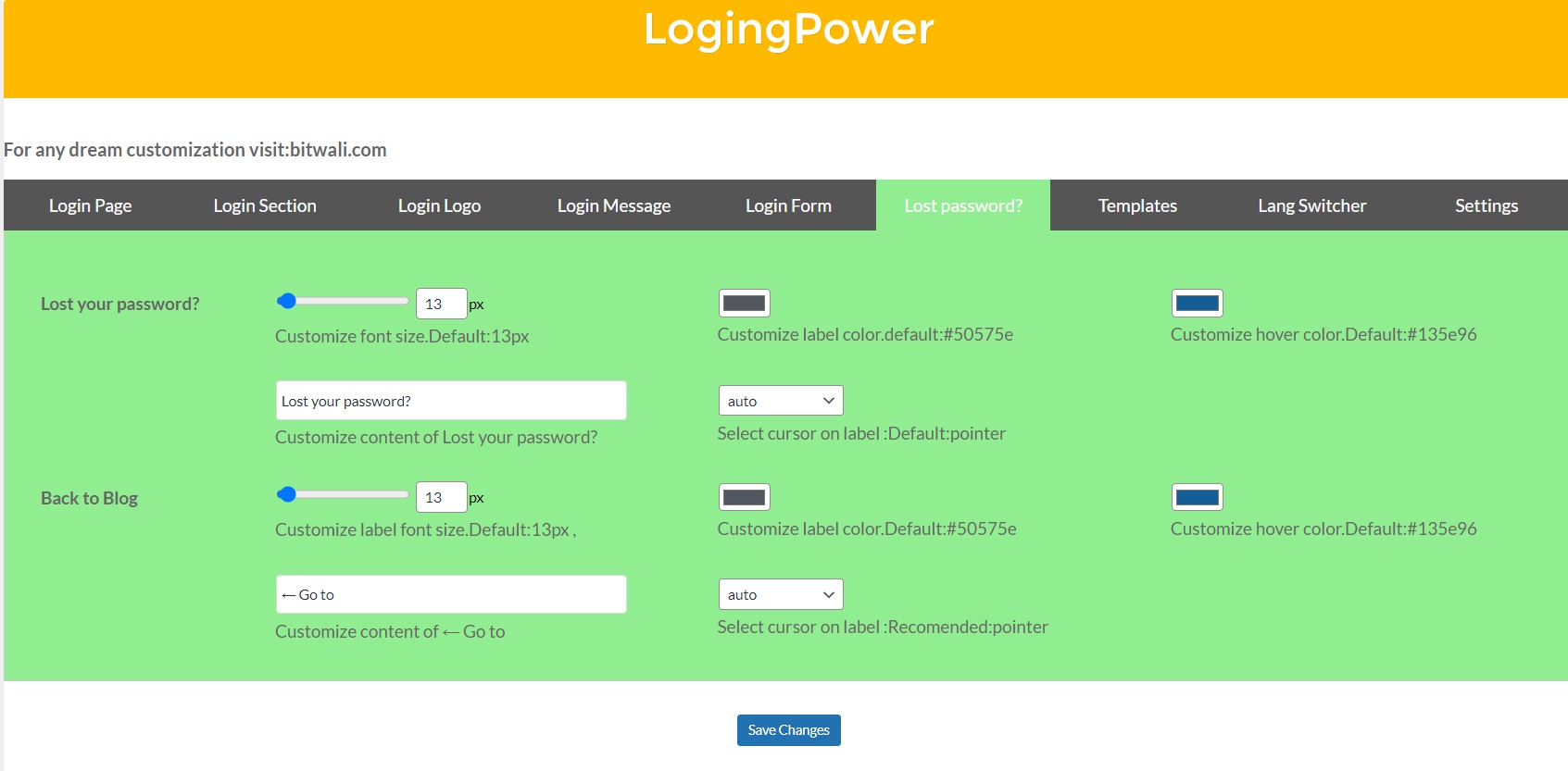
Lost your password? Font Size can be chosen from 13 pixels to 44 pixels by scrolling or entering. The default is 12 pixels.
Also change the label color of, Lost your password?, according to your need and style.
Hover is used to select a color for Lost your password? when you mouse over it.
To use label instead of "Lost your password?" , type your desired label in the text box. Click the Save Changes button.
Select a cursor from list on Lost your password?. Click the Save Changes button.
Back to Blog Font Size can be chosen from 13 pixels to 100 pixels by scrolling or entering. The default is 13 pixels.
Also change the label color of, Back to Blog, according to your need and style.
Hover is used to select a color for Back to Blog when you mouse over it.
To use label instead of "Back to Blog" , type your desired label in the text box. Click the Save Changes button.
Select a cursor from list on Back to Blog. Click the Save Changes button.
By selecting this template, there will be no default settings for the user. Everything will be selected by the user according to his choice.
By adopting leaf template, some preset settings are available to the user. Which can be changed now, the selection of everything will be done by the user on his own choice..
By selecting Logo template, some preset settings are available to the user. Which can be changed now, the selection of everything will be done by the user on his own choice.
Enable the checkbox to change the background color.
Very easily and concisely, change the background color from the color control or by typing or pasting the color code of the desired color into the text box.
From scroll or textbox code entry , width size language switcher change from 50% to 100%.
The default width of the left border of the Language Switcher is 0 pixel, it can be adjusted from 0 to 100 px with the scroll bar. Additionally, values 0 to 100px can also be entered in the text box..
A list of border styles is given. Click on the list, all the options in the list will be displayed, click on your desired option and save.
To change the color of the login page, two very easy methods are provided. Select your desired color from the color picker and click the Save Changes button, or copy and paste or type the hexadecimal number of your desired color into the text box. Click the Save Changes button.
Top Left Border Radius defines the radius of the top left's corners.Change the border radius from 0 to 100 pixels by scrolling or typing۔
Top Right Border Radius defines the radius of the top right's corners.Change the border radius from 0 to 100 pixels by scrolling or typing۔
Bottom Right Border Radius defines the radius of the bottom right's corners.Change the border radius from 0 to 100 pixels by scrolling or typing۔
Bottom Left Border Radius defines the radius of the bottom left's corners.Change the border radius from 0 to 100 pixels by scrolling or typing۔
Top padding creats space at top. You can adjust top padding from 0px to 100 px by scrolling or typing۔
Righ padding creats space at right. You can adjust righ padding from 0px to 100 px by scrolling or typing۔ ۔
Bottom padding creats space at Bottom. You can adjust Bottom padding from 0px to 100 px by scrolling or typing۔
Left padding creats space at Left. You can adjust Left padding from 0px to 100 px by scrolling or typing۔
To show Language Switcher background image, check the checkbox first then other features will be used.
Click the button to change the background image of the Language Switcher. Choose an image. Click Save Changes.
There are 4 options for the background image repeat of the Language Switcher, including repeat, repeat x, repeat y, no repeat, choose any option according to the nature of your image and beautify it.
We can resize the image by selecting from auto, width, height or both.
The opacity-level describes the transparency-level, where 1 is not transparent at all, 0.5 is 50% see-through, and 0 is completely transparent
Change the height of the change button, either by scrolling or by entry, from 20px to 100px.
Change the height of the change button, either by scrolling or by entry, from 65px to 200px.
Change the font size of the change button, either by scrolling or by entry, from 13px to 100px.
To change the color of the Change Button, two very easy methods are provided. Select your desired color from the color picker and click the Save Changes button, or copy and paste or type the hexadecimal number of your desired color into the text box. Click the Save Changes button.
Hover is used to select a color for Change Button when you mouse over it.
Customize change button label.
To change the color of the login page, two very easy methods are provided. Select your desired color from the color picker and click the Save Changes button, or copy and paste or type the hexadecimal number of your desired color into the text box. Click the Save Changes button
Select a cursor from list on Change Button. Click the Save Changes button.
A list of border styles is given. Click on the list, all the options in the list will be displayed, click on your desired option and save.
The default width of the left border of the Change Button is 0 pixel, it can be adjusted from 0 to 100 px with the scroll bar. Additionally, values 0 to 100px can also be entered in the text box..
To change the color of the Change Button, two very easy methods are provided. Select your desired color from the color picker and click the Save Changes button, or copy and paste or type the hexadecimal number of your desired color into the text box. Click the Save Changes button.
Top Left Border Radius defines the radius of the top left's corners.Change the border radius from 0 to 100 pixels by scrolling or typing۔
Top Right Border Radius defines the radius of the top right's corners.Change the border radius from 0 to 100 pixels by scrolling or typing۔
Bottom Right Border Radius defines the radius of the bottom right's corners.Change the border radius from 0 to 100 pixels by scrolling or typing۔
Bottom Left Border Radius defines the radius of the bottom left's corners.Change the border radius from 0 to 100 pixels by scrolling or typing۔
If any issue like "Deprecated: Automatic conversion of false to array is deprecated" appears then just clicking Save Changes will remove it.
Uncheck to save customized settings, check to to delete all customized settings and to restore all default settings.